
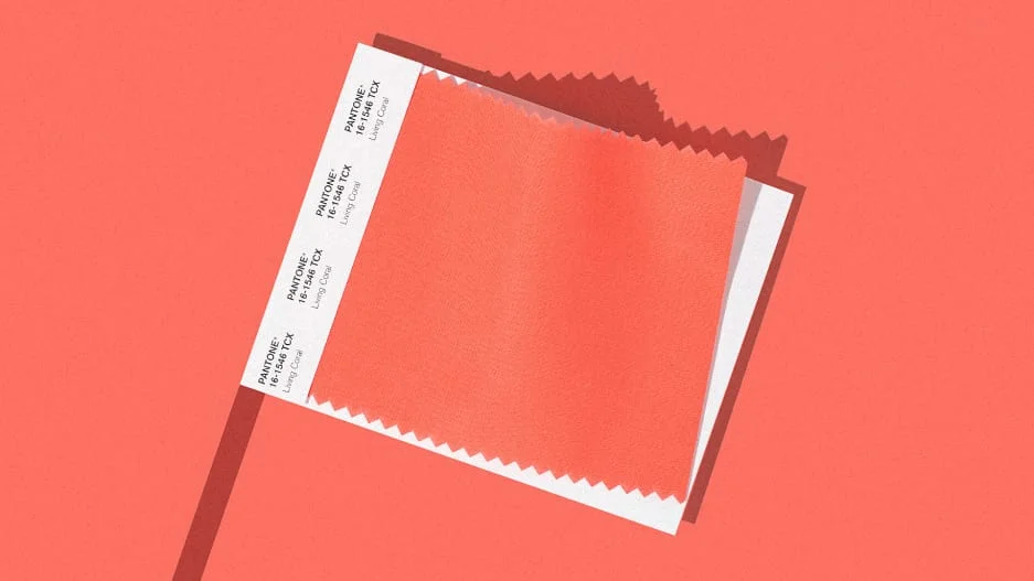

The reign of Millennial Pink–that literally and figuratively cool hue whose blue undertones flattered no one–seems to be coming to an end at last. In its place? We have Living Coral. It’s Pantone’s Color of the Year for 2019, following the company’s annual, wide-ranging analysis of color trends across culture. Living Coral is comforting and energizing at the same time, a color meant to serve as a salve in a time of global uncertainty.
“Just as coral reefs are a source of sustenance and shelter, we see this color giving us assurance and buoyancy in an environment that’s been continuously shifting for 10 years,” says Laurie Pressman, vice president of the Pantone Color Institute. “With technology, and all the [political] unrest around the world, our global culture has continued to accelerate this shift.”
If you buy into all of Pantone’s color psychology, it’s hardly a leap to interpret Living Coral as the color for a society that needs reassurance in the face of rising authoritarianism–the complement to the Blue Wave. As Pressman explains, Living Coral has roots in the 1950s and ’60s, where you could see it in cars, accessories, and fashion. Pressman says there’s “almost a retro feeling” to this color of Americana, which evokes “simpler times” without the patriotic baggage of red, white, and blue.
“That’s comforting!” says Pressman. “Because the more things try to push us forward, the more people reach back to what was, because they’re looking for terra firma. It’s scary! So you want things that make you feel safe, happy, that bring you comfort and warmth.”
But it’s more than sociological theory. Living Coral is also a very functional color that bridges the gap between our screens and real life.